
Creative
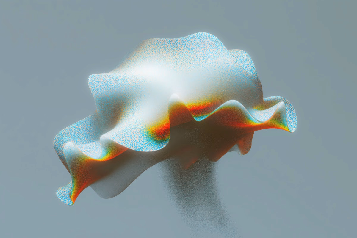
The power of aesthetics
In the crowded world of website templates, aesthetics often take center stage. Eye-catching visuals, bold color schemes, and sleek layouts are quick to grab attention — and for good reason. A beautifully designed website can make an immediate impact, drawing users in before they’ve even read a word. But when it comes to real performance, is visual beauty alone enough?
More than meets the eye
While strong aesthetics are essential for creating a memorable first impression, they represent just one layer of effective web design. A truly successful site balances form with function — where design doesn’t just look good, but serves a purpose. Here’s why visual appeal matters, and what it needs to work in harmony with to create a lasting user experience:
First impressions count
Your website is often your first interaction with a potential client or customer. A clean, modern design communicates professionalism, builds trust, and encourages visitors to stay and explore rather than bounce away.
Emotional connection
Design has the power to make people feel something. Through carefully chosen colors, thoughtful typography, and purposeful imagery, a website can set the emotional tone — whether that’s warmth, confidence, innovation, or calm — and forge a deeper connection with the audience.
Brand expression
Every visual element on your site is a reflection of your brand’s personality and values. From the layout to the photography style, the design should express who you are and what you stand for, helping you stand out in a competitive landscape.
In conclusion
Aesthetics are not just about decoration — they are a strategic tool. When paired with intuitive user experience, compelling content, and clear messaging, design becomes more than beautiful. It becomes powerful. The key is not choosing between beauty and function — it’s knowing how to bring them together.
The balance: aesthetics + functionality
Great design isn’t just about looking good — it’s about creating experiences that feel seamless, intentional, and intuitive. A beautiful website that frustrates users or hides important information quickly loses its impact. True design excellence lies in the harmony between visual appeal and practical performance. Here's how this balance plays out:
Usability
A clean, intuitive layout helps users find what they need without friction. Clear navigation, thoughtful spacing, and visual hierarchy guide visitors through your site with ease — turning design into a tool, not a distraction.
Performance
Even the most stunning design can fall flat if it loads slowly or behaves inconsistently across devices. Optimized images, responsive frameworks, and lightweight code ensure your site looks great and functions flawlessly — whether on a desktop or a smartphone.
Purpose
Every design choice should be intentional and aligned with your site’s goals. Whether you’re aiming to convert leads, share insights, or showcase work, your layout, typography, and color palette should support and elevate that purpose — not just fill space.
Feel authentic
Choose designs that reflect your brand’s tone and personality — not just what’s popular this month. A genuine visual style resonates far longer than a fleeting trend.
Enhance content
Your content should lead the way. Templates that offer balanced spacing, legible typography, and thoughtful structure allow your message — not the design — to take center stage.
Adapt gracefully
A great design isn’t locked to one screen size. Look for templates that scale and respond beautifully across devices, maintaining their structure and style without compromise.
In summary
A truly effective template is both a visual statement and a strategic tool. It should look stunning, yes — but it should also function smoothly, elevate your content, and align with your goals. When aesthetics and usability come together, the result is more than just a good-looking site. It’s a design that works.